Skip to content ↓

Graphic symbol

The AGH University graphic symbol is the only sign used for the everyday visual identification of the university. It has replaced the AGH University emblem in this role, which, in its current form, is reserved exclusively for promoting the history and scientific heritage of the university.

Promotional materials allow the use of the graphic symbol together with the full name of the university in Polish or English. The name itself might be incorporated symmetrically or asymmetrically in regard to the graphic symbol.

In the symmetrical layout, the name of the University is placed below the AGH University sign and centred in regard to the vertical axis of the ideogram.

The full Polish name of the university was designed in three versions: one-, two-, and three-verse layouts; the English one in two versions: one- and two-verse layouts. When choosing versions, keep in mind the size of the medium on which you reproduce the symbol and the compositional layout.

It is worth noting that the graphic symbol is one of many in the array of elements of the AGH University visual identity. To fully mirror the university’s graphic style, the symbol should always be accompanied by the proper typeface, colour scheme, and specified fonts and compositional motives.

Graphic symbol - download

We strongly recommend that you familiarise yourself with the details on how to use the AGH University graphic symbol specified here.

Layout of the AGH University graphic symbol

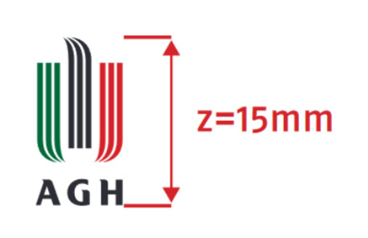
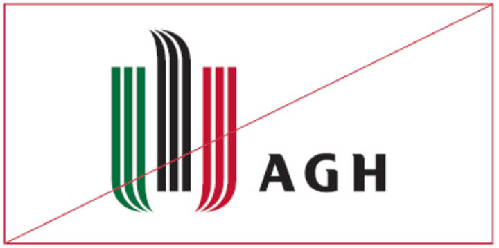
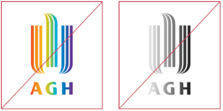
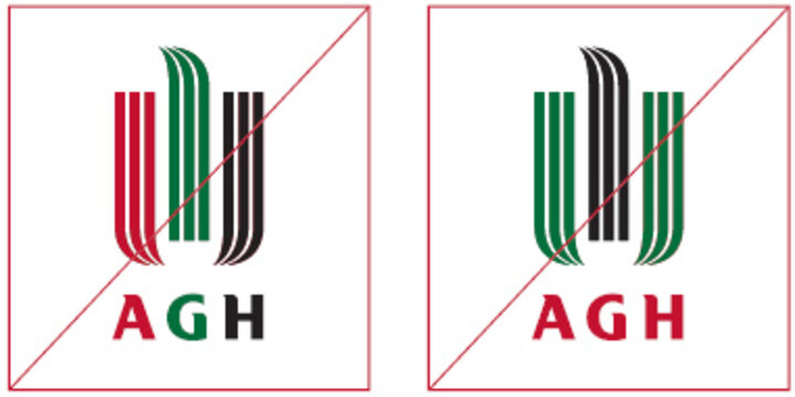
The AGH University graphic symbol consists of an ideogram and a logotype.

The ideogram comprises three parts, each of which consists of three longitudinal elements (stripes). Symbolically, it represents an eagle, which is an allusion and a simplified form of the university emblem. The ideogram has three colours: green, black, and red. The logotype constitutes the initial letters of the university name. They are written in a font specifically designed for the AGH University.

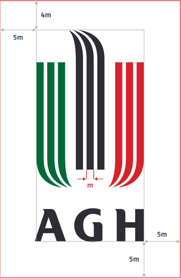
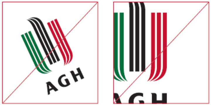
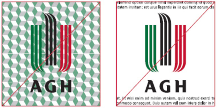
When using the AGH University graphic symbol, observe the minimum space that separates the logo from other elements. See below for the method of calculating the minimum space around the logo.

When using the AGH University graphic symbol, observe the minimum size of the logo, that is, not smaller than 15 mm.

Colour scheme

The colour palette is the fundamental component of visual identity and profoundly influences the perception of the receiver. Consistent application of a defined colour scheme, together with the care taken to ensure that all colours used on all identity media are alike, might be conducive to the colour scheme becoming the element that everyone recognises immediately and associates with the university.

The colours used in the coloured version of the graphic symbol – green, black, and red – pertain to the traditional symbolic colour scheme related to mining and metallurgy.

White is the complimentary colour appearing in the monochromatic, negative version of the symbol. The Pantone Opaque White paint is to be applied only in case of reproducing the aforementioned version of the symbol on backgrounds other than white (e.g., printing the symbol on gadgets in colours other than white).

Green

  • PMS: Pantone 349
  • CMYK: C100 M0 Y90 K40
  • RGB: R0 G105 B60
  • HTML: #00693C
  • RAL 6029
  • ORACAL 641: 613 Forest Green

Black

  • PMS: Pantone Process Black
  • CMYK: C0 M0 Y0 K100
  • RGB: R30 G30 B30
  • HTML: #1E1E1E
  • RAL 9005
  • ORACAL 641: 070 Black

Red

  • PMS: Pantone 187
  • CMYK: C0 M100 Y80 K30
  • RGB: R167 G25 B48
  • HTML: #A71930
  • RAL 3003
  • ORACAL 641: 030 Dark Red

White

  • PMS: Pantone Opaque White
  • CMYK: C0 M0 Y0 K0
  • RGB: R255 G255 B255
  • HTML: #FFFFFF
  • RAL 9003
  • ORACAL 641: 010 White

Rules of using the AGH University graphic symbol

Stopka